You can display X–Y plots of data written to the output database. For the tutorial you will display the vertical displacement of the rigid body reference node versus time.
The Visualization module also allows you to display X–Y plots of the following:
Data read from an ASCII file.
Data entered at the keyboard.
Existing data, either combined with other data or arithmetically manipulated.
You will now display an X–Y plot of displacement versus time.
To display an X–Y plot:
In the Results Tree, click mouse button 3 on History Output for the output database named viewer_tutorial.odb. From the menu that appears, select Filter.
In the filter field, enter *U2* to restrict the history output to just the displacement components in the 2-direction.
Expand the History Output container and double-click the data object containing the history of the vertical motion of the rigid body reference node: Spatial displacement: U2 at Node 1000 in NSET PUNCH.
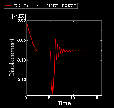
Abaqus displays an X–Y plot of displacement versus time, as shown in Figure D–11.
Default options selected by Abaqus include default ranges for the X- and Y-axes, axis titles, major and minor tick marks, the color of the line, and a legend.The legend labels the X–Y plot U2 N: 1000 NSET PUNCH. This is a default name provided by Abaqus.
By default, Abaqus computes the range of the X- and Y-axes from the minimum and maximum values found in the data read from the output database. Abaqus divides each axis into intervals and displays the appropriate major and minor tick marks. The Axis Options allow you to set the range of each axis and to customize the appearance of the axes; the Curve Options allow you to customize the appearance of the individual curves; the Chart Options and Chart Legend Options allow you to position the grid and legend, respectively. X–Y plot customization options apply only to the current viewport and are not saved between sessions.
To customize an X–Y plot:
From the main menu bar, select Options![]() XY Options
XY Options![]() Axis (or click
Axis (or click ![]() in the prompt area to cancel the current procedure, if necessary, and double-click either axis in the viewport).
in the prompt area to cancel the current procedure, if necessary, and double-click either axis in the viewport).
Abaqus displays the Axis Options dialog box.
Switch to the Scale tabbed page, if it is not already selected.
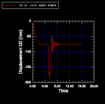
Specify that the X-axis should extend from 0 (the X-axis minimum) to 20 (the X-axis maximum) and that the Y-axis should extend from –200 (the Y-axis minimum) to 0 (the Y-axis maximum).
Tip: Select each axis in turn in the Axis Options dialog box, and then edit the scale as noted above.
From the options in the Axis Options dialog box, do the following.
In the Scale tabbed page, request that major tick marks appear on the X-axis at four-second increments (select By increment in the Tick Mode region of the page).
Request 3 minor tick marks per increment along the X-axis (this corresponds to a minor tick mark every second) and 4 minor tick marks per increment along the Y-axis (this corresponds to a minor tick mark every 10 mm).
In the Title tabbed page, type a Y-axis title of Displacement U2 (mm).
In the Axes tabbed page, request a Decimal format with zero decimal places for the Y-axis labels.
Click Dismiss to close the Axis Options dialog box.
From the main menu bar, select Options![]() XY Options
XY Options![]() Chart (or double-click any empty spot in the plot) to modify the gridlines and position the grid.
Chart (or double-click any empty spot in the plot) to modify the gridlines and position the grid.
In the Chart Options dialog box that appears, switch to the Grid Display tabbed page.
Toggle on Major in both the X Grid Lines and Y Grid Lines fields. Change the color of the major gridlines to blue; the line style should be solid.
Switch to the Grid Area tabbed page.
In the Size region of this page, select the Square option.
Use the slider to set the size to 75.
In the Position region of this page, select the Auto-align option.
From the available alignment options, select the fourth to last one (position the grid in the bottom-center of the viewport).
Click Dismiss.
From the main menu bar, select Options![]() XY Options
XY Options![]() Chart Legend (or double-click the legend) to position the legend.
Chart Legend (or double-click the legend) to position the legend.
In the Chart Legend Options dialog box, switch to the Area tabbed page.
In the Position region of this page, toggle on Inset and click Dismiss.
Drag the legend in the viewport to reposition it.
The customized X–Y plot appears, as shown in Figure D–12.
You will now display a second X–Y plot in a new viewport. To create a new viewport, select Viewport![]() Create from the main menu bar.
Create from the main menu bar.
The new viewport appears. The same X–Y plot that you had in the first viewport appears in the new viewport.
When multiple viewports are visible, the dark gray title bar indicates the current viewport; all work takes place in the current viewport. For more information, see “What is a viewport?,” Section 4.1.1 of the Abaqus/CAE User's Guide.
Tile the viewports vertically by selecting Viewport![]() Tile Vertically from the main menu bar.
Tile Vertically from the main menu bar.
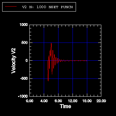
Create a similar X–Y plot of vertical velocity (V2) versus time. You cannot select velocity during the first step because the first step was not a dynamic step; Abaqus/Standard computed velocity and acceleration only during the second and third steps. Use the same X-axis range as before, and use a Y-axis range from 1000 to 1000. Label the Y-axis Velocity V2. The finished plot is shown in Figure D–13.